Friday Five with Alexis Joseph

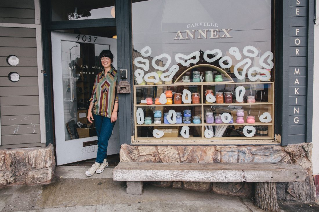
This month we are thrilled to chat with Alexis Joseph of ‘Case for Making‘- a San Francisco-based store of exceptional creative supplies.


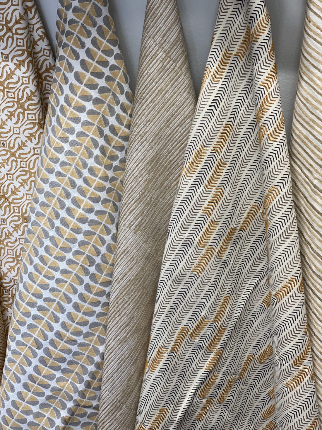
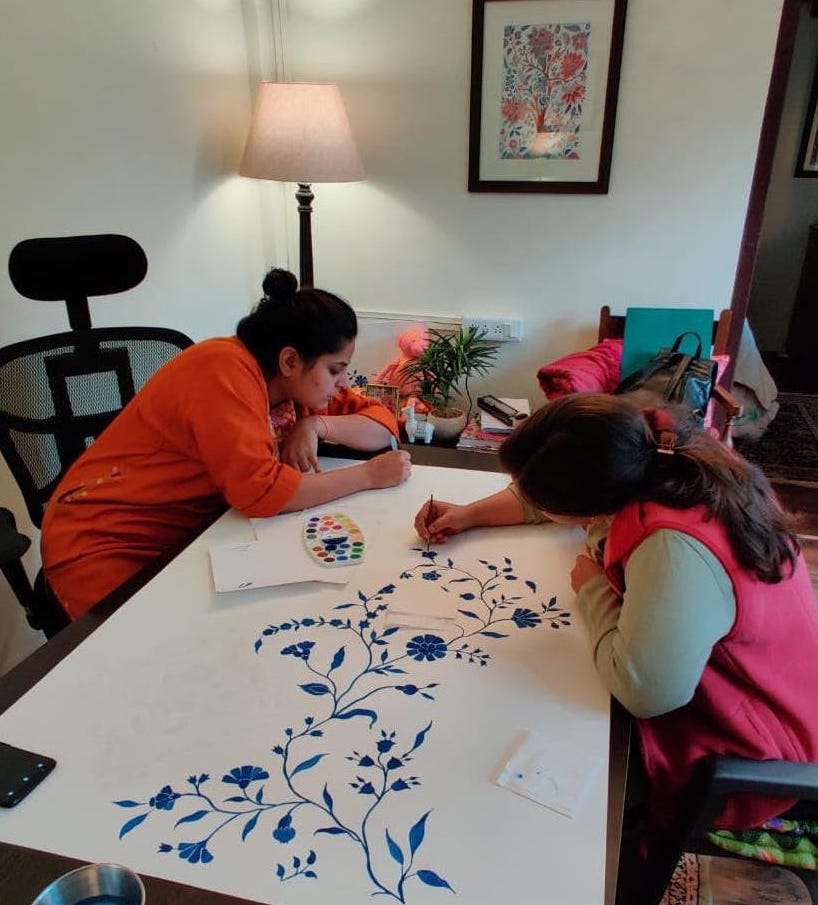
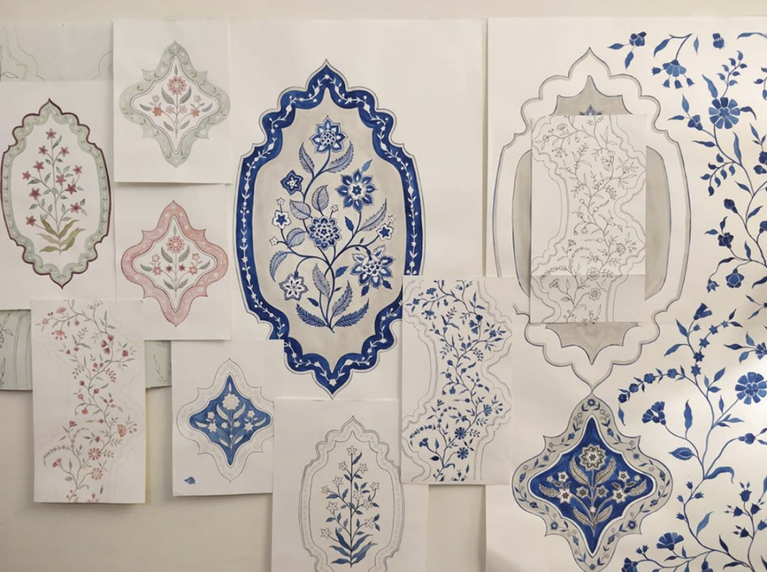
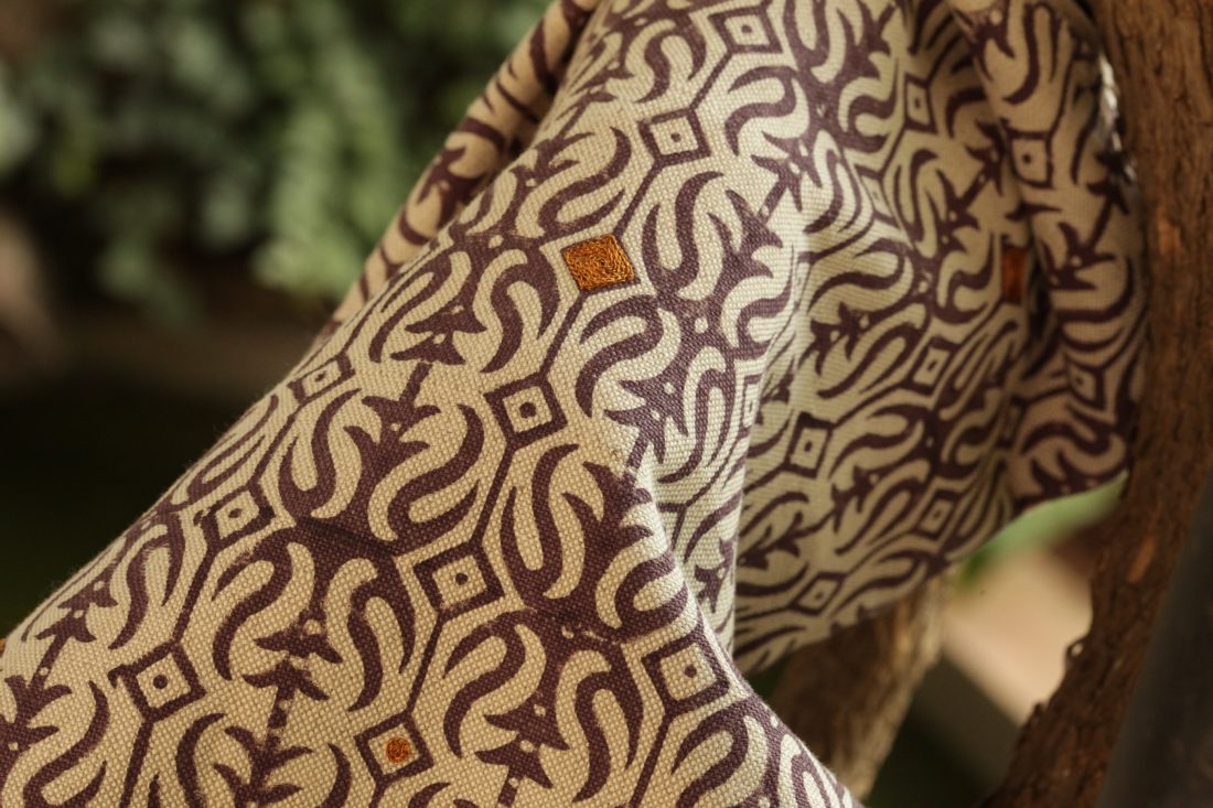
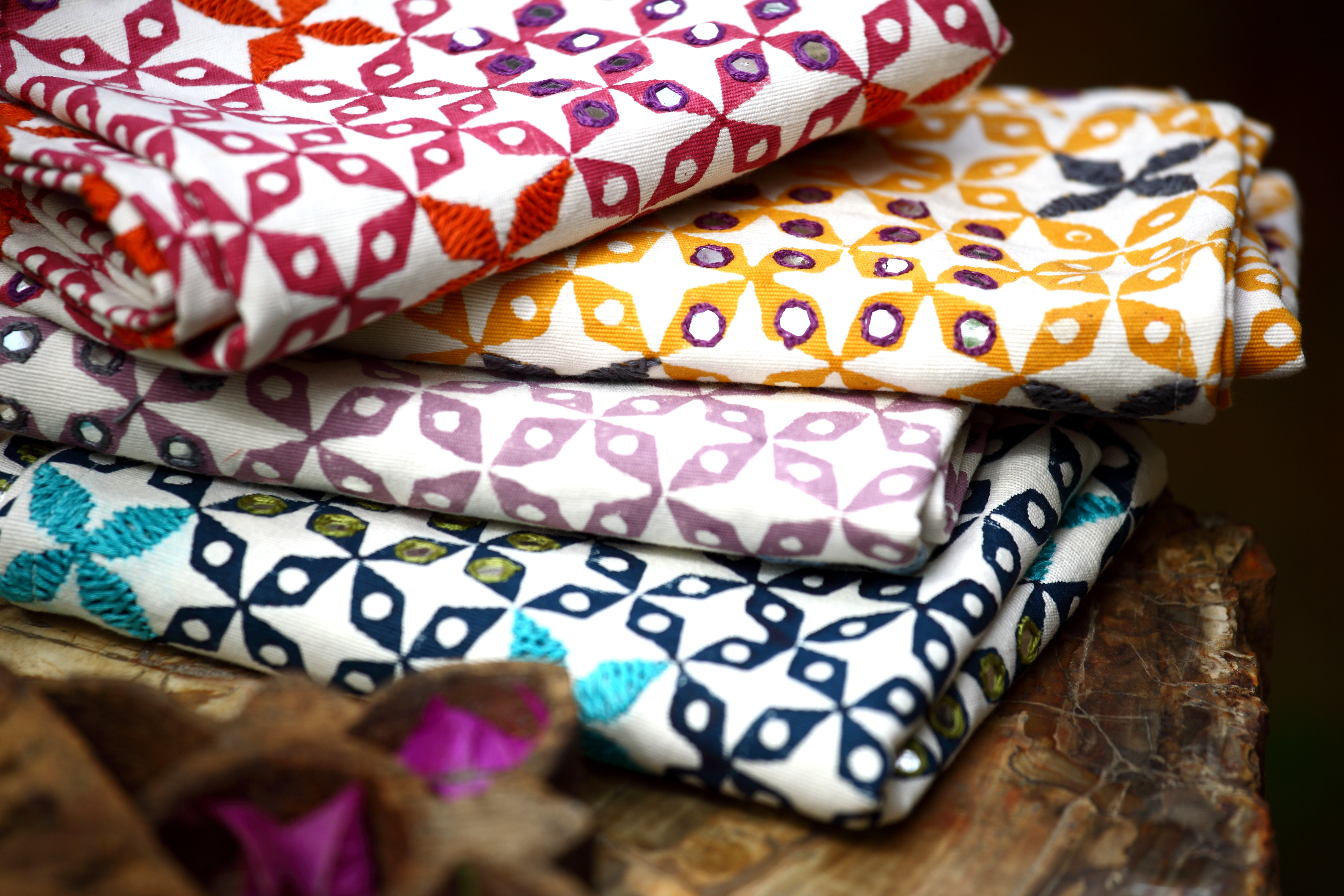
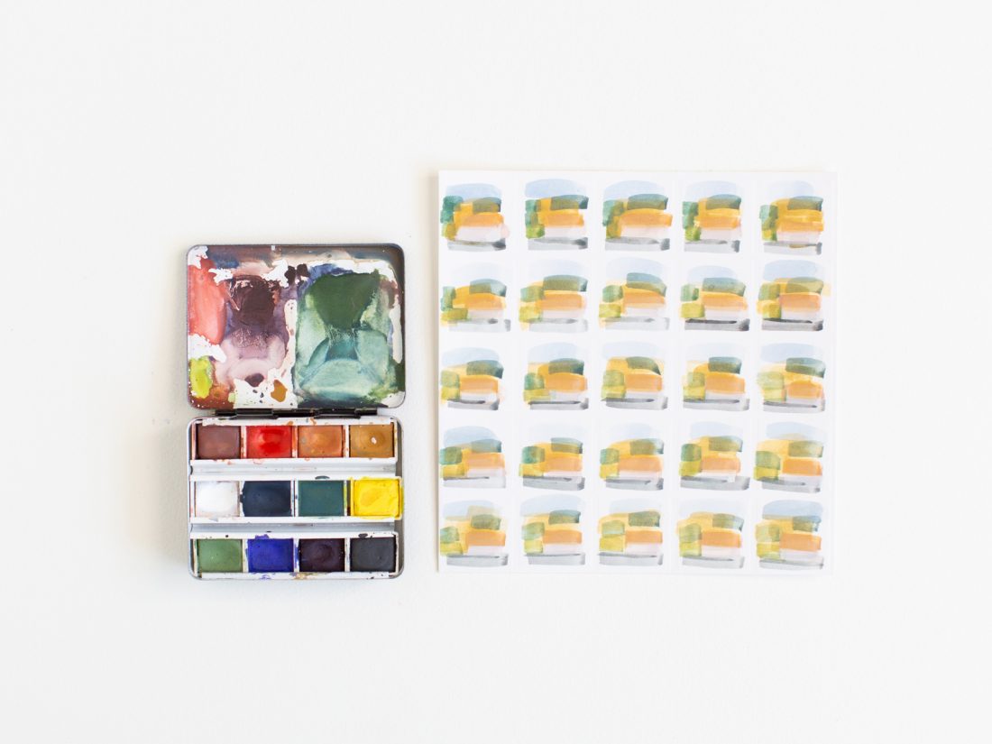
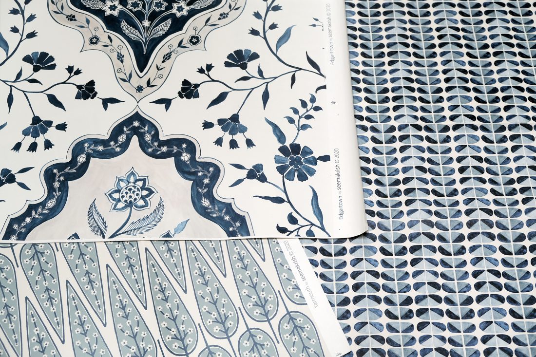
In our studio art practice, we enjoy using CFM watercolors, it’s where all of our artwork starts,
and the CFM colors play a large part in our process. We would not get the beautiful variations
within our patterns if it were not for the textures that the watercolors create.

_____________________________________________________________________________________________________________________

To listen to the conversation, tune into our IGTV here.

Here is an excerpt:

1 – How did you start Case For Making? And how did you get involved with color?

I started CFM six years ago. I had the lease on the building with friends and we were collectively using it as a flexible project space for a couple of years. And then we decided that we wanted a more permanent storefront presence in the space. Outerlands is on the same block and is owned by my friends, so I was able to have a full-time job there, while I started my business. When our lease was renewed, with the storefront, I was a little panicked as I wasn’t exactly sure what I wanted to do with the space. I looked over at my bedside table and I had my favorite pens that I’ve been buying in Japantown for most of my life and my little travel set of Winsor & Newton watercolors, as I looked at these things, I realized I would have an art supply store with a curated selection of items.

I went to Architecture school for undergrad and did my graduate degree in graphic design at California College of the Arts. I pulled out my phone and started making a list of all my favorite supplies that I had ever used. There never was a business plan. I operated by letting the business itself be a process and letting it organically evolve. I was able to do this because I maintained my full-time job at Outerlands for the first three years and transitioned full time to CFM in 2017. Initially, I had a store of curated art supplies, the colors came a few years later.

I was traveling in Germany and stumbled upon some pure pigments. Being an architecture nerd, I love exploring building materials stores in other countries. In Berlin, I wandered into a hardware store that was geared towards plasterwork, frescoes, and interior finishes. It was very different than what we have here. They had a section of their store that was just bins of bulk pure pigment. You scooped what you wanted into a bag and had it weighed at the counter. A gentleman had purchased some, I was amazed and enquired how he planned to use it. He explained that he was making paint for his apartment. I was stunned and did not realize that was a possibility!

For all of the art classes I’d taken throughout my life, I had not learned that paint is made from pure pigment. And depending on the kind of paint, the pigment is mixed with the appropriate binder. The possibilities were endless! Always thinking about built environments, I imagined using the pigment towards making paint for interior surfaces. I ended up buying a kilogram of ultramarine blue, brought it home, and began researching what I would do with it from an architectural perspective. I was interested to maintain the quality of the raw pigment.

And then I began to understand, what I had learned in art history classes about Yves Klein blue. He was obsessed with the same thing. Which was trying to find a way to bind the pigment without altering the surface quality. That is why when you observe his paintings, you are enveloped in this blue that has so much depth. All of this started coming together for me. Soon after, I came across Kremer pigments– a German company with a store in New York. On their website, they share recipes for making your own art materials and also teach workshops. I noticed they had oil paint and watercolor making workshops. I decided I would travel to New York to learn and it was the first business trip I ever went on! I took both classes and fell in love with the watercolor paint making classes. Which made sense, because I’ve always fallen back on watercolors throughout my life. And watercolors are the purest way to paint with pure pigment because the binder is Gum Arabic and is the most invisible way to bind the particles together. I became obsessed with material and realized that color was material because each color has its distinct chemical properties and the way that it binds to the medium. I experimented a lot and then soon after we started selling them!

I did not intend to be a paint company, it’s what happened based on my interest and learning. And now the bulk of my business is making and selling watercolors!


2- What is the main difference between hand mixed and commercially-made watercolors?

With hand-mixed colors, you are completely in control of everything that goes into it. As I started making paints, I realized that every color acts so differently based on the intrinsic qualities of the pigment. Which is something I had not experienced with commercially- made paints. When you squeeze a color out of a paint tube, you get just the color and not the textural personality that goes with it, you miss out on the tactile aspect. Commercial paint companies add extenders, fillers, and chemicals to equalize the paint experience for their brand. Each brand of paint is slightly different based on their recipes and what they want their paint to feel like.

It is rare to experience the variations that the pigments naturally create. When we hand-mix them, we only add natural binders to hold the pure pigment together. That is why our paints are rich, dense, and pigmented. When you paint with student grade or cheap watercolors, you try to re-saturate and get the color to release from the dry paint. With our paints, you apply your wet brush to the surface, move it around a little bit and the brush is saturated with color.

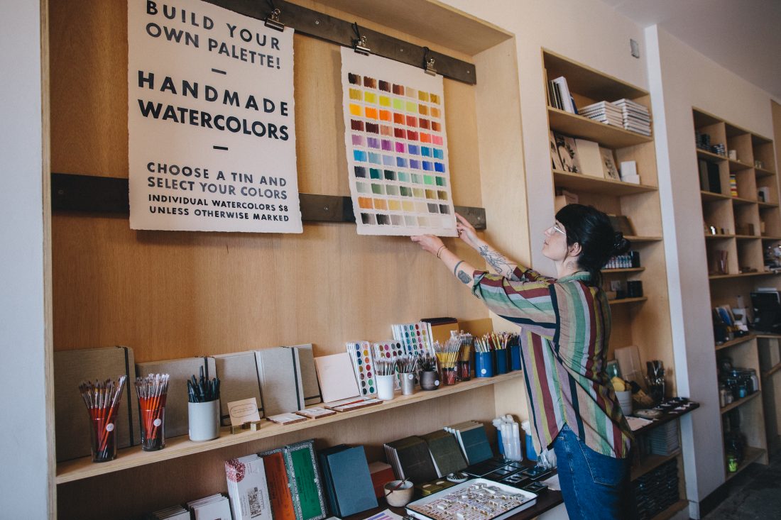
We currently carry over 70 colors. Most of them are single pigment colors. We have a wide variety, including metallics, natural earth pigments, and fluorescents and we also have a small group of blended pigment colors. Like Payne’s gray, which is a historic color, and was coined by the artist William Payne. He mixed his own specific warm gray color, that he used in his paintings. I was always drawn to Payne’s gray and that was our first attempt at coming up with our own ratio and lens for color. It sparked us to hone in on our color collection and we found the gaps and created the colors to fill out our overall palette. 14 of our 70 colors are blended colors.

3- How do you approach color? And add new colors?

Our approach is quite organic, we give a thought to rounding out our color palette. There are multiple ways to build palettes from within our collection. We have warm and cool option for the primaries, and then we have earth-colored pigments like ochre, red earth and burnt umber and then the metallics and fluorescents.

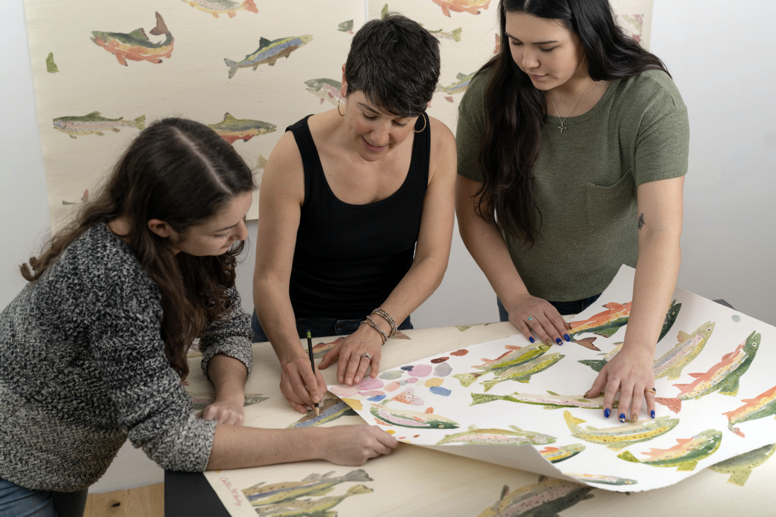
My team and I have been doing this together for four years and we constantly look through our colors, for example, our yellows- we may feel like we need to find some new yellows- so we will purchase twelve different options from various manufacturers, and we mix them and paint with them and then choose what we feel works the best.

As all of our colors are mixed by hand, we make sure that there is an ease in the making process as well- ensuring that the colors are non-toxic, cure well and paint well. If we’ve had a particular color in our collection for a period of time- we reassess if the colors still feel relevant.

4- What is your favorite color from your color palette?

I would have to say our blues. Blues are so rare in nature and the fact that they are prevalent in nature, in the water and the sky, it’s an ethereal color.

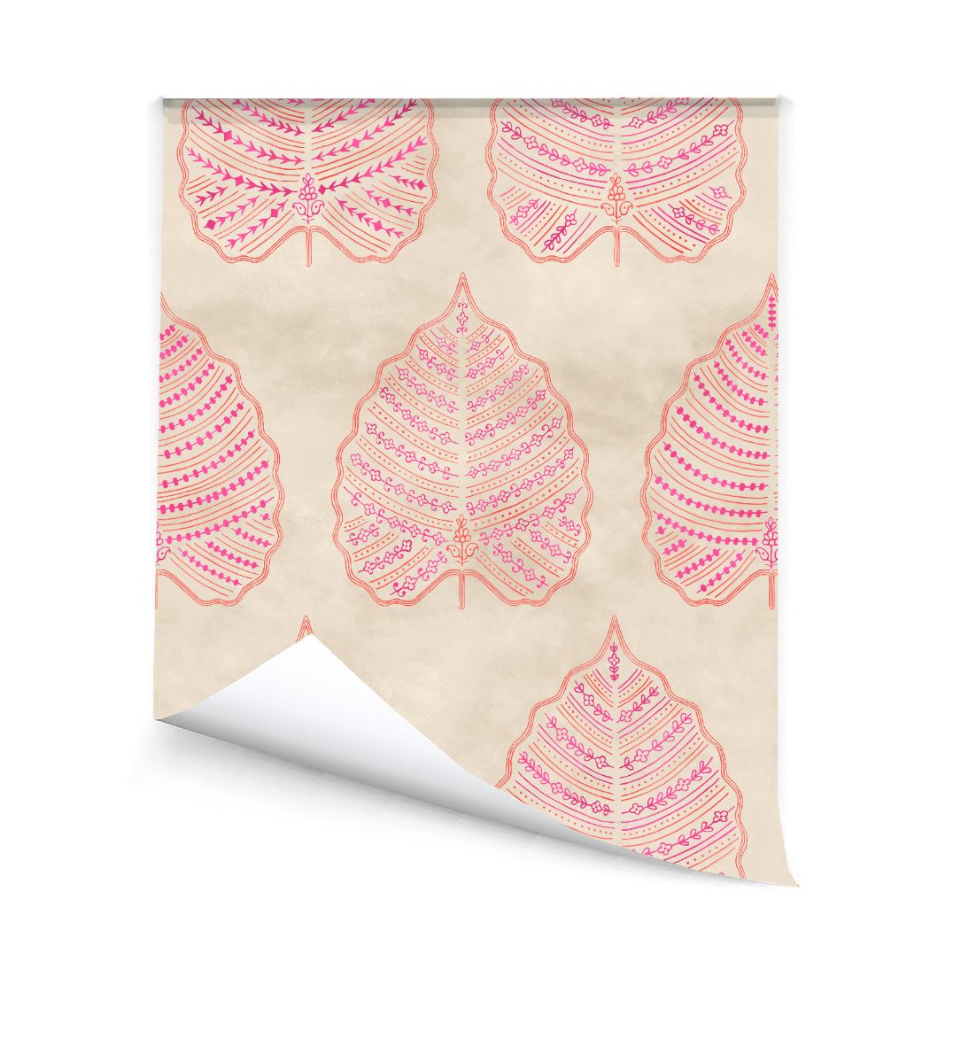
5- I have to ask, what is your favorite pattern and color from our line?

For me it’s Beacon, in the blue color. Seaport blue dark is my favorite color.

I also like  the pattern that you have behind you as your zoom screen.

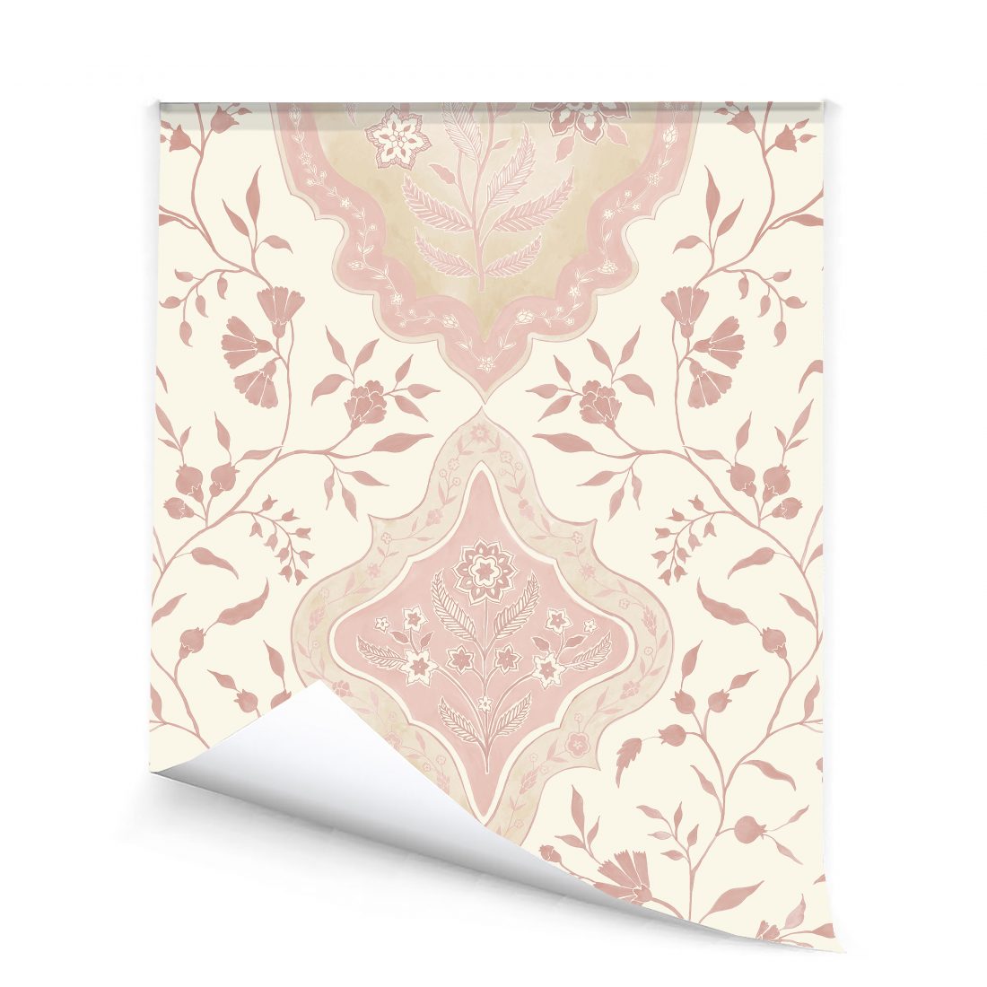
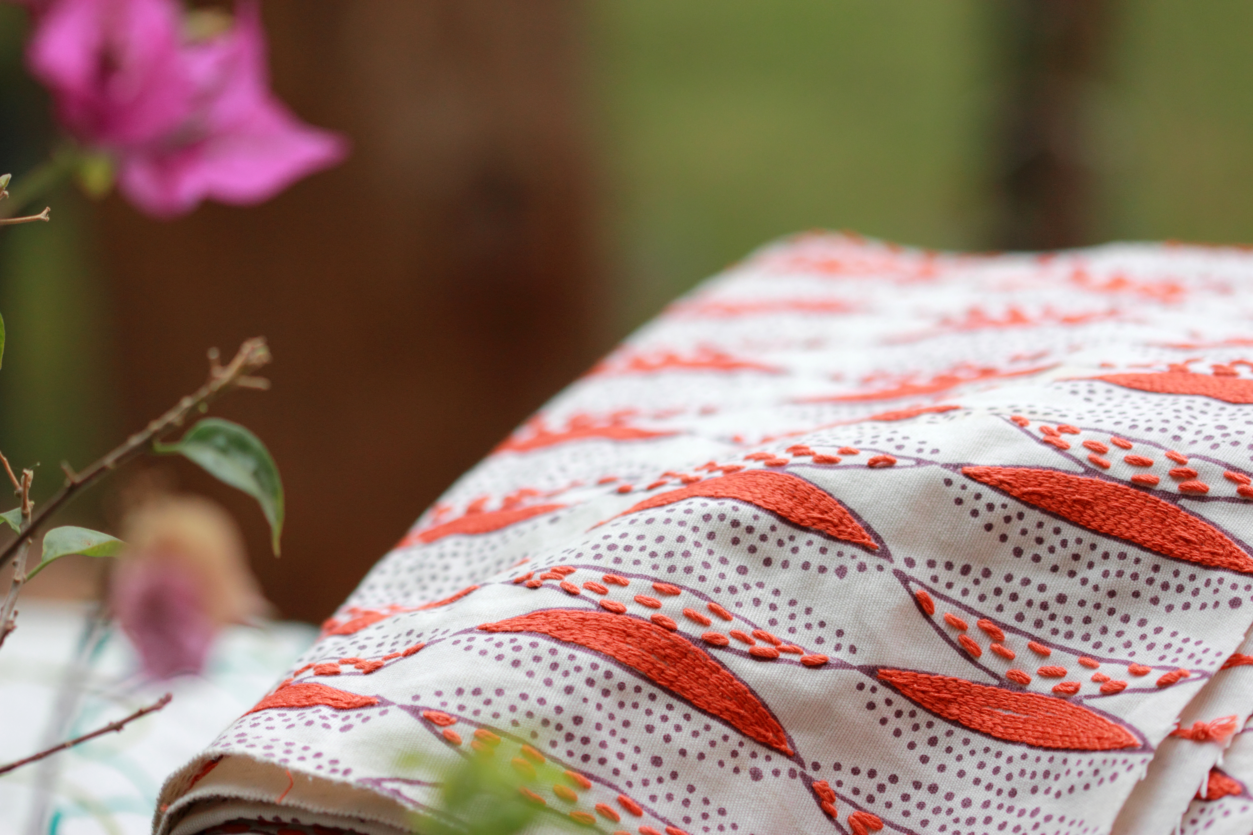
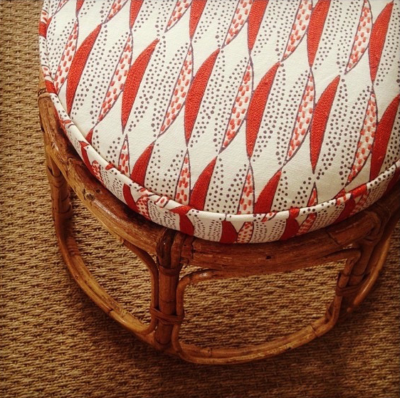
Seema: That’s our pattern Chowpatty as wallcovering and the artwork was created using your beautiful watercolors.


Friday Five with Carolyn Flannery

This week we spoke with the amazing, Carolyn Flannery, founder of Make it Home Bay Area.

“Make It Home’s mission is to furnish homes of families and individuals transitioning out of crisis or homelessness with donated, gently used, repurposed furnishings and household goods. Their vision is to end furniture poverty and bring hope to families while being self-sustaining, creating jobs and protecting the environment.”

_____________________________________________________________________________________________________________________

To listen to the conversation, tune into our IGTV here.

Here is an excerpt:

1- How did you transition from being a practicing interior designer to founding Make it Home?

I’ve been in the Interior design industry for 20-ish years, and about five years ago, I began volunteering by providing support services to foster families and kids. I became aware that often when foster kids age out of the system, they end up in a precarious position of lacking support services and sometimes this leads to homelessness

On the other hand, our design industry generates a lot of excess and waste of furniture and discarded stuff that is often perfectly good and just needs a new home. I decided to use my interior design skills in a new direction. My goal is to end furniture poverty and assisting foster kids and families by helping set them up in their homes by using the excess donated furniture, that would typically end up in landfills.

My husband and I decided that I would take at least a year off to explore and figure out if this could be viable. I’m 2 1/2 months into it and it has been a whirlwind, with a terrific response from the community. We have a 1600 sq foot space at the SFDC that is our furniture bank and it is already bursting at the seams with stuff! We have also already installed about 10-12 homes for foster families.

2 – You are currently accepting donated furniture and home goods. What is the criteria for those that want to donate?

We request photos in advance and ask for things to be almost new or gently used because we’re really hoping to have pride of place. I am having a lot of fun with it and it is a new challenge to be creative by curating stuff and making these environments beautiful and making them home, within the parameters.


3 – So what are the biggest challenges?

The biggest challenge is logistics. There’s a ton of stuff out there, it has to get to me at the furniture bank and then getting it to where it needs to go.

It is amazing how much stuff is out there and we really need to start taking responsibility for our belongings. I am seeing a trend of once someone doesn’t want the furniture anymore, they no longer take responsibility. I think part of our mission is getting people to understand and have a mindset of taking responsibility until it’s in a new home being loved by someone else.

4 – How could others get involved? What are your top needs at this point in time?

I’m overwhelmed with stuff! Volunteers that could help with curating, sorting, and organizing everything into viable kitchen kits, or bedroom kits, etc. will be very helpful.

Monetary donations are needed. Because logistics, unfortunately, don’t come for free!

Then the ‘big picture’ stuff. Anyone that would like to help with longer-term planning and ideas. Currently, I’m wearing twenty different hats and do not have the bandwidth for this.

5 – I have to ask, taking you out of your new world, what is your favorite pattern from our collection?

Everything you create is beautiful. I was first introduced to your work a few years ago, at DeSousa Hughes during a Fall into Fabrics event. I love the hand-crafted aspect and my favorite is the Juhu pattern.

And I also really like the Larkspur wallcovering, especially in the pink and orange. I love it!

November Favorites

Here are our current favorite books and pie recipes to inspire during this Holiday Season!

Books we’re reading:

Ninth Street Women

About the five women painters that dared to enter the male-dominated world of 20th century abstract painting.

Bisa Butler: Portraits

A look into Bisa’s mesmerizing quilted portraits.

Illustration 2020 – Works of 150 Japanese Illustrators

Capturing the “now” of Japanese illustration from pop culture to all things kawaii.

Charlie and the Chocolate Factory

An all time classic!

We ❤️ Pies:

Seema’s Favorite: Cranberry Curd Tart (From NYT Cooking)

Ingredients – (Serves 8 to 10)

FOR THE HAZELNUT CRUST:

  • 1 ¼ cups/180 grams raw hazelnuts
  • 1 cup/125 grams rice flour
  • ¼ teaspoon salt
  • ½ cup/112 grams sugar
  • 6 tablespoons/100 grams softened butter, more as necessary

FOR THE CRANBERRY CURD:

  • 12 ounces/340 grams cranberries
  • 1 cup/225 grams sugar
  •  Peel (orange part only) and juice of 1 orange (about 1/2 cup)
  • 4 ounces/113 grams softened butter (1 stick)
  • 2 eggs plus 2 egg yolks

Preparation

1. Make the crust: Heat oven to 325 degrees. Put hazelnuts on a baking sheet and roast for 10 to 15 minutes, until skins darken and crack. Put roasted nuts in a clean towel and rub off skins. Discard skins and let nuts cool.

2. In a food processor, grind nuts with half the rice flour until mixture resembles coarse cornmeal. Add remaining rice flour and salt and pulse briefly.

3. Cream sugar and butter in a mixing bowl with a wooden spoon for a minute or two until pale and thick. Add nut mixture and combine until dough comes together. If it seems crumbly, add 1 to 2 tablespoons softened butter or a little cold water.

4. Press dough evenly into a 10-inch tart pan; use half the dough for the sides and half for the bottom. Prick bottom with a fork and freeze for 30 minutes (or several days if desired).

5. Heat oven to 350 degrees. Bake chilled tart shell about 15 minutes until lightly brown. Cool.

6. While the crust bakes and cools, make the cranberry curd: Put cranberries, sugar and orange juice and peel in a saucepan over medium heat. Simmer until cranberries have popped and softened, about 10 minutes. Transfer to a food mill or medium mesh sieve and press cooking liquid and solids into a bowl. (Alternatively, for the most vibrant color, purée the cooked cranberry and orange mixture with an immersion blender or in a food processor or blender. Press through a fine-mesh sieve.) Whisk the butter into the warm liquid.

7. Put eggs and egg yolks into a bowl and beat lightly. Slowly whisk a cup of warm cranberry liquid into the eggs to temper, then combine both and whisk together. Wipe out pot if necessary, return liquid to pot and cook over low heat until nearly bubbling and thickened, about 10 minutes. If using immediately, let cool to room temperature. If working ahead, cool to room temperature, cover with plastic wrap (press wrap against curd) and refrigerate. (Curd may be cooked up to 1 day ahead.)

8. Pour cooled cranberry curd into the cooled prebaked tart shell and smooth top with a spatula. Bake at 350 degrees for 10 minutes to set curd. Cool on a rack. Store at room temperature for up to 2 days.

Hannah’s Favorite: Sylvia’s Pecan Pie

Ingredients –  (Makes two 9” pies)

  • 2×9 -inch pie crust, unbaked 
  • 1 cup brown sugar
  • 1/2 cup granulated sugar
  • 1 tbsp flour
  • 2 large eggs
  • 2 tbsp milk
  • 1 tsp vanilla
  • 1/4 tsp salt
  • 1/2 cup butter, melted
  • 1 cup chopped pecans

Preparation

1. Put all of the ingredients in a bowl. Mix with a fork until combined. Pour into the pie crust.

2. Bake at 375˚F, rack in the middle position, for 40 – 45 minutes.  The top of the pie should be golden, crunchy, and firm while the inside of the pie is still jiggly.

3. Cool on a rack. Cover tightly and store in the fridge.

Alex’s Favorite: Chocolate Cream Pie with Oreo Crust (From NYT Cooking)

Ingredients – (Serves 8 to 10)

FOR THE CRUST:

  • 2 cups/270 grams Oreo crumbs (from about 24 standard-sized Oreos)
  • 4 tablespoons/57 grams unsalted butter (1/2 stick), melted
  • ½ teaspoon kosher salt

FOR THE CUSTARD:

  • ½ cup/100 grams granulated sugar
  • 3 tablespoons cornstarch
  • 2 tablespoons cocoa powder
  • ¾ teaspoons kosher salt
  • 3 cups/720 milliliters whole milk
  • 6 large egg yolks
  • 8 ounces/225 grams semisweet bar chocolate, finely chopped
  • 2 tablespoons unsalted butter, cut into small cubes
  • 1 teaspoon vanilla extract

FOR THE TOPPING:

  • 1 cup/240 milliliters heavy cream
  • 1 tablespoons confectioners’ sugar
  •  Crushed Oreos, for garnish (optional)

Preparation

1. Heat oven to 350 degrees. Add Oreos to the bowl of a food processor and process until fine crumbs form. Add melted butter and salt, and process until crumbs are evenly moistened. Tip mixture out into a 9-inch pie plate, and press crumbs evenly into bottom and sides of pan. Bake until crust is fragrant and set, about 12 minutes. Transfer to a rack to cool.

2. Set a fine mesh sieve over a medium bowl. In a medium saucepan, whisk together granulated sugar, cornstarch, cocoa powder and salt. Pouring just a little at first, whisk the milk into the sugar mixture until you have a smooth paste. Gradually add remaining milk, whisking constantly. Whisk in egg yolks. Cook mixture over medium heat, whisking constantly, until it has thickened and just come up to a low boil, about 8 to 9 minutes. Continue to cook, stirring constantly, for 1 minute.

3. Pour custard through sieve, pushing it through with a rubber spatula. Discard any solids. Stir in chocolate, butter and vanilla, and let it stand for 1 minute. Stir until smooth. Pour mixture into prepared crust. Let cool slightly, then cover loosely with plastic wrap and chill until firm, at least 6 hours.

4. To serve, whip cream and confectioners’ sugar until soft peaks form. Top with whipped cream and sprinkle with crushed Oreos, if using.

Masaki’s Favorite: Warm Apple Crumble with a scoop of Vanilla (Preppy Kitchen)

Ingredients – (Serves 8 to 10)

FOR THE PIE CRUST:

FOR THE FILLING:

  • 1/4 cup lemon juice freshly squeezed
  • 3 lbs apples Honey crisp, Cortland, Granny Smith, or Mitsu 
  • 2/3 cup sugar plus more for sprinkling on the pie
  • 1/4 cup unsalted butter
  • 1/2 tsp ground cinnamon
  • 1 pinch ground nutmeg
  • 1 tbsp corn starch

FOR THE EGG WASH:

  • 1 egg
  • 1 tbsp cream

FOR THE CRUMBLE:

  • 3/4 cup All purpose flour 90g
  • 1/2 cup light brown sugar 100g
  • 1 tsp cinnamon
  • 1/2 cup unsalted butter melted, 113g
  • 1/2 tsp salt

Preparation

1. Roll out your chilled pie dough into a disk about 1/4 inch thick and an inch or so larger than your pie dish. Transfer the dough into the pie dish leaving half an inch of overhang. Trim the edge as needed then fold under and crimp the edge. Transfer to the freezer to chill while you make the filling.

2. Add the flour, salt, sugar, and cinnamon to a bowl then mix until combined. Pour in the melted and cooled butter then mix once more. If the butter is too warm the mixture will form a glob instead of crumbles.Just pop in the fridge to chill a few minutes and break up with your hands if that happens.

3. Peel, core and slice your apples, then toss with the lemon juice. Cut your apples into similar sized pieces so they cook at the same rate.

4. Add the sugar, cinnamon, and nutmeg then toss to combine evenly.

5. In a large skillet, melt the butter over medium-high heat. Add the apples, and cook, stirring, until the sugar dissolves and the mixture begins to simmer, about 2 minutes. Cover, reduce heat to medium-low, and cook until the apples soften and release most of their juices, about 7 minutes. While the apples are cooking down you can mix in the corn starch.

6. Pour the apples into a strainer set over a large bowl. Set the apples aside and pour juice back into the pan. Cook at medium-high heat stirring frequently until the liquid bubbles vigorously and thickens. The liquid will be thickened to the consistency of caramel when It’s ready.

7. In a medium bowl, toss the apples with the reduced juice. Set aside to cool completely.

8. Heat oven to 400F. Mix the egg and cream, or milk in a small bowl then Brush the edge of the pie with it. This is optional but gives your crust a golden finish.

9. Add your filling to the dish and smooth out surface with a spatula. 

10. Sprinkle the crumble on top of the pie covering the surface completely. Transfer the pie dish to a baking sheet then loosely wrap the edge with foil. This will prevent the pie from burning while you wait for the center to bake through. 

11. Bake at 400F for 15 minutes then reduce the temperature to 350F and bak an additional 50 minutes or until golden brown in the center. You can remove the tenting in the last 20 minutes If the edge needs some color.

Friday Five with Deb Fedasiuk

This week we spoke with our Phoenix showroom representative, Deb Fedasiuk of Deb Design Source.

We started working with Deb at the beginning of this year, just before our world changed!

_____________________________________________________________________________________________________________________

To listen to the complete conversation, tune into our IGTV here.

Here is an excerpt:

1 -Please tell us about you your background and how you got started in the Interior Design industry?

I have represented Interior Design brands in the Phoenix area for over fifteen years. But I originally started in advertising and PR in New York and was working with big consumer packaged goods for a number of years. I eventually moved over to the client-side and I found my way into home-improvement products. I started working with Minwax wood finishes and stains.

I branched out to another company that worked with wall coverings products- adhesives, primers, and paint primers. It was there that I was introduced to Thibaut wall coverings. I assisted them with publicity marketing and helped them grow in the early days when HGTV was just starting up in the DIY network space. I was working with producers there and with a lot of magazines and syndicated columnists. It was a lot of fun!

We moved to Arizona shortly after I started with Thibaut. I was doing a lot of commuting back and forth to New York and working remotely from my Arizona office. Eventually, I migrated into sales and management work and started doing outside sales and I really loved it. Then I transitioned to doing outside sales for multiple brands, and then this past year decided to open my own showroom.

2 – What are some of the lines that you represent in addition to ours?

The three anchor lines that I represent are: JAB textiles, Maria Flora, and Maya Romanoff. Beyond that my goal is to introduce new and different lines to our market, as we have a really active and expanding design community with limited resources. For the size of our design community, we don’t have a large Design Center nearby, like the Pacific Design Center in LA or out in Denver and San Francisco.

I wanted to bring some of the boutique and specialty lines to share with our local interior design community. Brands like yours, Kettlewell collection, and Clay Maclaurin. Suzanne Tucker Home had never been here before, although that’s a little more classic and traditional, it fits in really well. John Robshaw and Nichola Taylorson are two other lines that I’ve brought in.

All the lines that I represent are complimentary, but with their own subtle nuances. The designers have responded well, because it’s new to our area and provides them with fresh and different new looks.

3 – Your passion for your work really shows through, what do you love the most about it?

I enjoy finding new and different things and sharing them with designers. I love being a resource and bringing different ideas and concepts that I’ve seen in my travels and from my experience that could broaden the scope of what they could offer their clients.

In my showroom display, I waterfall memos by brand and I plan to expand this when I upgrade my space next month.

The goal is to have everything clearly on display, so that my clients get a good overview of each line. If they were to just pass through them on display wings, they may not be as inspired.

You are getting ready to move into a new, larger space, amidst this pandemic, could you share more about this decision?


The response has been terrific and I am in a really great location with fantastic neighbors. I knew I would need to expand at some point and did not want to see the opportunity pass me by when the perfect location came available. This new space will allow me to have an expanded display and will make a big difference.

I started in Interior Design sales by being a road rep, and was working out of my car and would bring in curated materials to my appointments. I’m excited to offer my clients an immersive environment and the ability to experience the variety of the products that I represent. I look forward to inspiring them in my new space!

Our clients have started coming back to by-appointment, in-person shopping, safely with masks on. Next week on Monday, we are hosting an event with about ten people outdoors in the courtyard of my building and I am looking forward to welcoming my clients back. We have all been so isolated that it is nice to start having small, safe events to interact and inspire each other again, as long as we are safe and smart about it.

4 – If you were not in interior design sales, what would you imagine doing?

I would probably be working in PR and publicity, working with editors, and in marketing for textile-type companies or others in the home improvement design area. Previously, I pitched products to editors and I had a passion for doing that. So it was easy to translate that to sales and to working with designers directly. It is a similar message and it’s about sharing what’s new in an innovative way.

5 – What is your personal aesthetic and in your own home?

I would say I’m transitional in my style. I’ve also got a modern farmhouse going on in my house. I’m still working through it, but I am exposed to so many beautiful things that it’s hard to make decisions! I keep a somewhat neutral base, so that I can add in pops of color and pattern.

I have to ask, what is your favorite seemakrish textile or wallcovering pattern?

Well, I have a whole bunch! I love, love, love the gold colorways.

I like Chowpatty, Mahalaxmi, Manhattan, Olema, and Juhu.

Juhu maybe my favorite! I could definitely see it in my house. Chowpatty is another favorite. I like it because it’s kind of quiet but still has movement and I like the mix of the embroidery with the print.

Friday Five with Cloth & Kind

This week we connected with our friends and Michigan showroom representatives, Tami Ramsay and Krista Nye Nicholas of Cloth & Kind.

Krista and Tami are interior designer partners of their Cloth & Kind studio with offices in Athens, Georgia, and Ann Arbor, Michigan.

_____________________________________________________________________________________________________________________

To listen to the complete conversation, tune into our IGTV here.

Here is an excerpt:

1 – How did you get together and start your interior design business?

TAMI: Apropos of our times, bizarrely we met through technology. We both were early adopters to Pinterest and at that time it was still, if you can imagine, very small and relatively intimate. You followed people and I would sit down, have coffee, and look through their pins. The person that frequently came up was Krista! I had pinned something that was a chaise longue that I was planning to use in my living room. (This was long before private boards!) Molly Andrews that owns Chairloom had also pinned it, and then Krista who followed Molly also and knowing that Molly refurbished old furniture assumed that it was something that she was selling, and so commented “yup, that’s exactly what I need for my new living room”. And Molly said, “Actually, that’s not mine but you should meet Tami, you’ll have a very similar aesthetic.” And that was it, it was kind of Kismet. So it was a chaise longue brought us together!

We had a very similar aesthetic and a passion for textiles specifically. So we talked on the phone and then decided to travel and meet each other at a design conference to meet in-person and stay with each other for the first time. We were rooming together, which is crazy, and then by the end of those three days, we decided to go into business together.

KRISTA: We shared all our dirty secrets and were like, “this is what you need to know about me, and this is what you need to know about me. Okay, I’m in! I’ll take it.”

TAMI: Yeah, it was very much kind of a whirlwind love affair that fortunately worked out. But logistically it has definitely been something that took a fair amount of organization and has certainly scaled and grown over the years. But essentially, it was Krista and me for the longest time collaborating on everything until we were in a position to hire more people and the rest is history.

2 -What has been your favorite design project? And what is a dream project for you?

KRISTA: One of our favorite projects has been a large historic home that we did in St. Louis, Missouri, which belongs to the Chancellor of the University. We worked on the design in partnership with Wash U, and the Chancellor and his wife. It is a beautiful home, to begin with, but it was really wonderful from a creative standpoint to have the exposure to art from the Kemper Museum of Art, from which, we were able to make selections for the home. It was a total collaboration across both of our offices and all of our team members. We still haven’t photographed it yet. We had plans to and then COVID hit, so now we’re hoping we can photograph it in the Spring. It was a magical project and interestingly quite traditional, so design-wise a departure for us. We dove deep into red like we never had before and were immersed in traditional European antiques.

For creative people like us, it was a dream come true to have the opportunity to explore a totally new different genre and spend time learning. We both came out of it really appreciating reds so much more than we ever have!

TAMI: A future dream project would be a boutique hotel. That would be really, really fun. Something that allowed us to totally trick out a space with a theme. We have done a few set-design type things before and although that’s not the same as a boutique hotel, the similarity is focusing on a concept and repeating it in different variations throughout the space. I think that would be really fun!

KRISTA: It’s going to happen, putting it out into the universe!

3 – What influences and informs your design aesthetic?

KRISTA: When we met, we spent a lot of time talking and discovered our mutual love of textiles first and foremost, specifically artisanal textiles. We were really drawn to the block printed and hand screen printed textiles, like your line.

We talked a lot about travel and its major source of influence and inspiration for so many creatives. That was something we had in common. We had both had the experiences of living overseas in different cultures and that influenced us and our own personal design aesthetic for our own homes. And it’s the confluence of how our experiences have come together and melded.

4 – How did you expand your business into your very own boutique showroom in Ann Arbor?

KRISTA: From the very beginning, we wanted to have a boutique showroom. Initially, it was to be a shop or retail experience that focused around textiles, which evolved over time into our trade-only showroom. Tami being close to Atlanta has proximity to ADAC, which is an exceptional design center. By contrast here in Michigan, I felt like we just didn’t have that. We sought out the textile lines and we would work with showrooms in New York like Studio 4, or Harbinger or Nicky Rising in LA. We would reach out to whoever had the lines. I really struggled with that as we were buying a lot of artisanal textiles, and were not a small client, but it was hard getting memos or any attention.

So Tami and I gave it some thought and felt it was a great opportunity to support the artisanal lines that we loved while filling a need to cover the middle part of the U.S. that was being ignored.

It’s been fun and is ramping up slower than we thought, but being about 2 1/2 years in, we are past the learning curve and it’s starting to take on a life of its own and is just wonderful.

As we are not in a major metropolitan design area, we have gotten really creative with seeing people on the road, and these days in virtual appointments. It is important for us to make it really easy for designers to shop. One of our biggest pain points is not being able to get the needed information in after business hours, which is inevitably when work we are all working.


This led us to soon be launching a password protected portal for to-the-trade shopping. We are beginning with 3 lines and seemakrish is one of them! Clients with approved trade accounts could shop the lines based on our approved territories of representation. They could shop memos and get quotes. We are excited to be rolling this out shortly!

We have to ask, what are your favorite seemakrish patterns- textile or wallcovering?

TAMI: My first contact with you was because I wanted some pillows in the Breach Candy pattern in blue. I love, love, love that color. I still have and love the pillows. And yours is still one of my all-time favorite textile lines with the combination of the block-print and the kantha stitch. It’s just beautiful.

KRISTA: From your latest collection, it’s the wallcovering Edgartown. I am blown away, it is absolutely gorgeous and I can’t wait to use it.

TAMI: It reminds us of India, some of the big public palaces that we visited where we would see these beautiful and elaborate patterns. It evokes that experience.

KRISTA: My original textile fave s probably Chowpatty. I just love it. I was originally introduced to you by my mother, who has always been a design enthusiast and lived and breathed for the next issue of House Beautiful! When I was getting started, she pointed me in your direction. I hadn’t yet heard of you and so I checked out your line and was immediately obsessed. I ended up ordering Chowpatty in Peacock Blue for my mother, and it is on their kitchen roman shades. Then I ordered a custom colorway of it for a guest bedroom in my house. Beautiful as well. Love it!

Friday Five with Jen Hewett

We are pleased to welcome our friend and fellow San Franciscan, Jen Hewett to our ‘Friday Five’ series today.

Jen is a printmaker, surface designer, textile artist, author, and teacher who creates visually layered, printed textiles. We love her color-saturated prints and bold aesthetic.

_____________________________________________________________________________________________________________________

To listen to the whole chat, tune into our IGTV here. And to see Jen’s colorful prints, visit her website.

Here is an excerpt from the conversation.

1 – What was your journey to becoming a textile artist?

I had corporate jobs for a number of years and one day in 2008, on a whim, I decided to take a screen printing class as a creative outlet. I was absolutely hooked from the first project! Soon after, I was laid off from my job as it was the beginning of the Great Recession in 2008. I suddenly had all this free time on my hands and ended up going to the print studio, every free moment I had, and was screen-printing on paper. Mostly because I was too scared to try printing on fabric, and being unemployed, I could not afford the cost of experimenting with textiles.

What I began to notice was that people did not know what to do with my prints on paper. And the feedback was that they would like to see my patterns on textile products like tea towels or tote bags. So I decided to leap in and see if I could print on fabric and when I made the leap from paper to fabric, that’s when my work really took off.

But I didn’t think of myself as a textile artist. For years, I saw myself as a printmaker, and I still do actually. It was when I was in London in 2013, and was at the V&A and experienced this really beautiful Turkish textiles exhibit, after just being in Istanbul, when I felt like everything was converging. I had this very clear thought in my head, that I wanted to be a textile designer. It just came out of nowhere and that was when everything clicked for me.

2 – What is some advice you would share with someone considering going on this journey? And what are some of the joys and challenges that you’ve experienced?

Well, I think the biggest advice to those trying to make a career switch to the Arts, do not quit their day jobs until they completely ready. Because the hardest thing to do is to develop your own voice and not follow trends. You need to have the confidence to work from your own voice and then you can follow trends, rather than have the trends dictate your voice and aesthetic.

I worked as an HR consultant and with startups for several years before making the jump to being a full-time artist. And the reason I did that was so that I can really hone what it was that I was doing creatively and that I did not have to rely on my creative work to pay my bills until I felt really confident about the work that I was creating.

3 – Could you tell me more about your published book and about your next one?

My first book was a technical block printing book focused on printing on fabric and creating your own designs. It’s called ‘Print, Pattern, Sew’ and it came out in 2018. And then my second book is called, ‘This long thread: women of color on craft, community, and connection’. It contains personal narratives, interviews, and oral histories of women of color in the US mainly and a little bit in Canada, who do textile, fiber arts, and crafts. So knitting, weaving, printing on fabric, sewing, quilting, and you are featured in the book too! I think you are the only one of two textile designers that I have in there. The book will be available to purchase in December 2021. At least it’s something to look forward to!

4 – You have been involved in creating the subgroup, #TextileArtistsForMVP as part of the Movement Voter Project, and collectively the group has raised $50,330 for this project. Please can you tell me more about how that came about? And more about the project?

I learned about MVP through my friend Chi Nguyen, who is a weaver and an amazing community organizer and lives in New York. We met because I interviewed her for my upcoming book. Chi had met with MVP and was really excited about mobilizing her community to raise funds for MVP that essentially distributes funds to grassroots progressive organizing groups in different states. So it’s not about supporting a particular political campaign but is particularly about supporting local organizations that do work around voting and voting rights.

She had the idea to organize textile artists, and so she asked me and weaver Erin Riley, and hobbyist knitter, Betty Farrell, who works full-time in healthcare. Each of us started reaching out to our networks and got people super excited about donating work, hosting an auction, or contributing a portion of their sales towards MVP. Chi originally had thought a good goal was $3,000- $5,000. I had thought that $20 to $30,000 was more accurate because we had a group of about 100 artists, to begin with. Within the first two to three weeks, we hit $30,000. And then it took on its own momentum and other artists started joining in. We ended up raising $50,330. So many of us feel kind of powerless right now and your vote does count. But also, if all you’re doing is voting, it’s really not enough.

I think it’s a very American thing to throw money at a project, right? But activating group energy within a community made a lot of people, including myself, feel like we really are doing something and putting ourselves into it. There is a certain amount of risk of going on social media to say that I am supporting this group. I also know a lot of folks who aren’t used to selling their work while being political online. I think this was a really good opportunity for a lot of artists to dip their toes into it and it was, quite honestly, for me a highlight of an otherwise really terrible year.

I think it allowed people to see just how powerful and how far their efforts can go because a lot of us could individually donate a certain amount of money quite easily. We could’ve each donated $100 and then we would easily have $20,000. But our collective effort pulls so many more people together and it raises so much more, not just money, but awareness. And it creates a conversation and a dialog.

5 – Since you’re a surface designer and a textile artist, I have to ask, what is your favorite seemakrish textile or wallcovering pattern?

You have this new wall covering that is gorgeous and different from everything else that you do in that it’s more detailed. It’s called Edgartown.

I love your work and the block print look, but this pattern is unique.

Friday Five with Shambhavi Tiwari

Our ‘Friday Five’ guest today is artist, Shambhavi Tiwari.

We were acquainted with Shambhavi’s drawings via her Instagram feed @shambhavit and were instantly drawn to her work.

We collaborated with her on our most recent collection of textiles and wallcoverings. It was a wonderful process and a new experience for our studio, as typically our artwork is completely created in-house.

Our new patterns, Edgartown and Yarmouth originated as a result of this collaboration.

_____________________________________________________________________________________________________________________

To learn about the journey of our collaboration, tune in to the conversation on our IGTV.

Here is an excerpt:

1 – Tell me about your background and about your art.

I am a print designer currently based in Jaipur, with studios in Nainital and in Delhi. I develop original artwork for clients who use them in their projects- including home furnishings, apparel, tableware, and wallpapers. It will be six years since I started as a freelance designer, and now I have a team of five people who work with me.

My area of expertise revolves around traditional Indian floral designs inspired by traditional craft and art. I love interpreting them in my own way and have developed my own style of drawing.

2 – How did you develop your unique style? Did you go to art school?

I studied textile design at the National Institute of Design, in Ahmedabad, India. We were introduced to the world of print through my years of study there. I only started drawing in this particular style and took a deeper interest in prints after quitting my first job working at an export house in Bombay. A friend had gifted me a book by Rosemary Crill on Chintz.  It inspired me to start drawing and I drew every day to hone my skill. Six years later, I haven’t stopped drawing! That’s where my journey began.

When I started drawing, I tried to understand the craft of Chintz and the language of the medium: the proportion of the florals to the leaves, and how a pattern is constructed. I then started interpreting it in my own way, created my own language, and began experimenting with colors.

3 – What materials do you use to create your artwork?

I use the humble cartridge art paper and my favorite pencil from Muji. I use a mechanical pencil because I travel a lot (at least I did pre-pandemic!). My pencil, paper, and a watercolor tray are always with me, along with a Pentel brush pen. Most of the conceptualization and ideation happens on paper. If my clients need a digitized version, then I use Adobe software to provide that dimension.


4 – Has the current COVID pandemic impacted you in any particular way? 

My clients have used this time to take a break and conceptualize new collections, and they would like to emerge from this with a bang! So I have a lot of work and am very busy with projects. Although the pandemic has hit hard in India and we are generally in this period of transition. 

When the lockdown began, I was very excited because I thought that I would have time to paint a lot and gather a collection of prints. On the contrary, I ended up doing nothing and was baking a lot! What I learned from this time is to take each day as it comes. Just try to do your best for that day and then sleep feeling content!

What is your favorite pattern in our collection? 

I have a lot of favorites. But I love Juhu, it’s so beautiful. The embroidery with the ombre effect is really special. It’s simple with a lot of attention to detail. It’s beautiful and so are the other patterns.

When you launch the new collection, I think I might have a new favorite!

Friday Five with Kyra Hartnett

Our most recent ‘Friday Five’  guest is Kyra Hartnett, co-founder of Twenty2 Wallpaper.

In 2001, Twenty2 started as a multidisciplinary firm, founded by Kyra and her husband, Rob. They created graphics and interiors for retailers as well as full-service residential projects. 

We are lucky to partner with Kyra and her team at Twenty2, to translate our patterns to wallcoverings.

_____________________________________________________________________________________________________________________

Here is an excerpt from the conversation. To listen to the whole chat, tune into our IGTV here.

1 – How are you, your family and the business is doing at these uncertain times?

We feel incredibly grateful that our family is healthy. Our work team is healthy and business has remained robust during this time. There certainly was a bit of a slowdown in March, and we were prepared for the worst, but I feel grateful that things have remained robust. I am thankful for the position that we are in and recognize how privileged we are to be working in an industry with a big future.

2- What led you to start Twenty2 and how did you come up with that name?

We founded our business in January 2001, almost 20 years ago. My husband and I are partners, and we met at work at an Australian clothing retailer in NYC called Country Road. It was one of those companies where they provided a lot of autonomy. It was big enough that you could approach a project that you were not nearly qualified for, and it gave the best experience. 

I was a drama major in college. I had no previous work experience relevant to what I was doing at Country Road in marketing, customer service, and brand building, but I took on those different roles. Rob started working right out of high school in retail and visual store display, so he did not go to college and just went for it. He felt like he could make something of himself another way, through learning on the job. We had a great magnetism at work. 

We quickly fell in love and got married in the fall of 2000. We realized that we wanted to parlay that connection and that aptitude for working together into something else. Rob left Country Road shortly after we married and dabbled in production design and other things related to design. We were given the opportunity by a college friend of mine, an actor named Taye Diggs, to create his first grown-up pad in New York City. He knew that I love design, and knowing him very well, I could design his home as a reflection of his personality. He remains a wonderful friend to us and, we’ve since created several apartments for him. It was a great opportunity that led us to where we are today. 

We became immersed In high-end home decor and fell in love with mid-century modernism, vintage furniture design, and throughout our work, we focused on the wall.

We were coming out of the 90s era where things were minimal and stark. Our business beginning coincided with 9/11, and we understood people’s desire to nest and layer their spaces in a much warmer way than the austere look of the 90s, which I think is a lot of what’s happening right now during this pandemic as well. I think people realize and take comfort in the safety and the sanctity of their homes. 

We spent time at the Cooper Hewitt Museum in New York City, one of the country’s most extensive wallpaper archives. The curator at the time still works there today, and is an incredible asset to our industry. He let us just pour over all of these incredibly beautiful screen prints to help inform where we might want to go with this idea. 

We decided to make a wallpaper collection. We started meeting with manufacturers, which was incredibly hard to find back then. Much has changed in terms of the generosity of our industry’s spirit, where we all share resources. Our current business model has benefited immensely from word of mouth. People thought we were crazy because the wall covering industry had shrunk so much since the 80s!  We decided to go all-in, as you do in your 20s when you don’t know any better. We innovatively used screens to make multiple SKUs and launched the collection at ICFF  (International Contemporary Furniture Fair) in 2003. We were one of maybe three wallpaper exhibitors that year, which is certainly very different now. 

We quickly established ourselves out of a showroom in New York City, where we were the only wallpaper line. We became known as the wallpaper people because the wallpaper was so unique. For about 10 years, we developed our own collections and were represented in showrooms across the United States. Then, we transferred our talents to what we are doing now, which is being a manufacturing resource and partner for other designers. 

We no longer make our own patterns or prints, we do not want to compete with our customers, and we want them to feel safe sharing their pattern work with us. It has been an incredible transition for us to leverage the equity of our knowledge and expertise and we have a lot to offer to our customers.  It’s a collaboration with our clients that take advantage of all that we can contribute to their development and success. Our goal is to build a long-lasting partnership. 

So the name, funnily enough, was a lucky number of Rob’s growing up. He had a band called Route 22.  When we were thinking of a business name, that’s what we landed on with the quirky early 2000s spelling of the word Twenty and then the number 2. When we were in one of our first interviews for a press piece, someone said to us,  did you meet when you were 22? We did the math and had met when we were 22 but had not realized it, so it seems to be working out well for us, and we’re going to stick with it.

3- Can you tell us more about your plans to expand your business into other categories?

For several years we have adjusted our business model to become manufacturing partners for wallpaper but have always loved textiles as well. Rob is passionate about technology and is always looking at the next new wallpaper machine that we could get to provide the very best result for our customers. Similarly, he has kept his eye on textile printing and the available manufacturing methods. He is focused on the environmental impact of these various methods,  because a large portion of the world’s water pollution comes from the textile industry. We care about our environmental impact in all details of our processes down to shipping materials and internal efforts. 

Pre- COVID, we decided to expand our offering to textile prints enabling our customers to produce textiles and wallcoverings in one place. It will streamline the process for a lot of our customers.

This summer, we started shifting into gear and rented more space in our building, doubling our space. Just a few years ago, our team was three or four people and now we’re seventeen people! We needed to ramp up our hiring efforts to ensure that our textile clients received the same kind of service. We have customers anxiously awaiting collaborating with us, and we found some great talent to join us. We are moments away from starting that new endeavor.

I have to ask, what is your favorite textile or wallcoverings pattern of ours?

I love your Bandra wall covering.

I think it’s so beautiful on grasscloth.

I also really love the Juhu, which is iconic to your brand.

The Marine Indigo colorway on the gray grasscloth is graphic and beautiful, and one of my favorites. 


To listen to more of our conversation, including the additional  questions below, tune into our IGTV

4- If you were not doing textiles, wallcoverings, and design, what do you think you would be doing?

5- What’s something you’re grateful for that has been meaningful? Have you created any new routines during this time of quarantine and homeschooling?

Friday Five with Christine Chitnis

We began our ‘Friday Five’ IGTV interview series as a fun way to stay connected and engaged with our community during this time of social distancing. 

Listen to our conversations and meet our favorite interior designers, artists, showroom sales staff, our artisan partners, and others that inspire us. 

Through a set of 5 questions, we provide a glimpse into the world of these remarkable people.

A person smiling for the camera

Description automatically generated

Our most recent guest is author, Christine Chitnis.

“Christine Chitnis is an author and photographer. She lives with her husband and three young children, Vijay, Vikram and Meera, in Providence, Rhode Island. Her writing and photography are inspired by the farmland and coasts of her adopted home state, though her love of the natural world dates back to childhood summers spent in Northern Michigan. After traveling to India for over a decade with her husband, Vijay, her book, Patterns of India: A Journey Through Colors, Textiles and the Vibrancy of Rajasthan is out now!” (from her website)

Christine is the author of ‘Patterns of India,’ a gorgeously crafted book that highlights the beauty of Indian patterns and colors explored through the vibrancy of Western Indian culture. Beautiful in imagery and story, Christine’s personal journey comes through each page.

_____________________________________________________________________________________________________________________

Read an excerpt of the conversation…

1-    What is your background and how did it lead you into writing books?

I have a journey that meanders. My degree was in environmental studies, For a long time, I wrote about our food systems from a sustainability standpoint, and I wrote for various publications and explored a wide range of topics. So, anything from gardens at prisons to gardens at public schools, to land access in New England, I was immersedin the world of local food and food systems in New England. That led to my first book, which was called ‘Markets of New England’, a small little travel guide to local farmers and artisan markets throughout New England.

That launched me into a publishing career that I’ve had ever since. So back to back, I wrote two cookbooks, exploring how to introduce local foods to young children because I had my boys who were really young at that time. I was feeding them and taking them along on this journey with my background and while writing, and so that book was called ‘Little Bites’, which was my second book. Then, because I try to feed my kids a low refined sugar diet, I had developed interesting recipes and my third book was a dessert book. All free of refined sugar and specifically frozen dessert, so popsicles, ice cream and yogurt. That was called ‘Icy, Creamy, Healthy, Sweet’. 

2-    How did you get interested in India as inspiration?

I had built up an archive of photographs from my first trip there. I would see these color stories present themselves and I would notice that the pink fabric of a woman’s sari would echo the rose chains hanging on the flower stands, and all of these various shades of pinks and these reds that, to my eye were very specific color stories that kind of weaved throughout the culture touching on all aspects of dress, food, architecture, and textiles.

I feel like I have both an insider’s and an outsider’s view. I’m obviously a white woman from the US. I’m a tourist when I go there, and yet I’m traveling there with my husband, who speaks Hindi and Bengali and practices Hinduism. I’m there as a tourist and a guest in the country, but I’m also there in a more intimate way. That’s why I think I felt I could tell this story in a way that was respectful and knowledgeable of the culture and that shared a bit of my husband’s stories. 

Then tie it all together with the color stories, patterns and some of the rich history. I had a wonderful group of friends and professors and people willing to guide me and read over the work to make sure that everything I was writing was culturally appropriate and correct and reflective of India, both the history and also today, as a modern country. That was really important to me. And I think, having a foot in both worlds and traveling with my husband and then my children and seeing it through their eyes, allowed me a unique perspective that I am grateful for.

3-    Did you take the images while traveling before you had the book idea, or did you specifically have the idea and then take these images?

That’s a great question. They were taken mostly before I had the book idea. I took one trip after I had signed the book contract and knew specifically what to focus on, which at first was color. My team at Clarkson Potter, were wonderful and suggested we focus on pattern as well because that would position the book towards the interior design world too.

4-    Who are your favorite authors and what books are you reading these days?

I’m a huge reader and I love to read fiction. I just finished one of my favorites that just came out called, “The Vanishing Half” by Brit Bennett. But I think one of the first authors I was introduced to after I met my husband was Jhumpa Lahiri, a favorite of mine. Her writing helped me understand a little bit of my in-laws’ experience in moving to the West without knowing anyone and the loneliness of that immigrant experience. Her writing touches beautifully on that.

I have been making this one recommendation of reading “Station Eleven”, which is about a pandemic, but in a weird way really interesting and fun to read. It’s so good and it will freak you out and that’s been enjoyable.

5-    Your book is organized beautifully by color, what is your favorite color, and do you have a favorite image?

Yes, definitely pink is my favorite color so the Rose chapter is without a doubt my favorite. Most of the frescoes and the patterns used in India are some of the most inspiring ever seen. a around and show them pictures and the little boy was shy at first and I just remember meeting them and it was beautiful. When I travel and my kids are with me now a lot, that also bridges the gap between languages. They play together and they’ll pull out a little matchbox toys and then they go off and they’re fast friends. It’s such a culture that just loves and really cherishes children, so I think when you travel with children, it opens you up. With each picture in here I remember the exact time it was taken in that moment. I think that’s what makes it special for me to look through and remember.

 I have to ask, since you’ve written a book about pattern and color, what is your favorite pattern in our line of textiles and wallcoverings?

I love your Bandra pattern and I have to figure out what I can make or cover in that pattern, probably a chair? We have some good friends that live in the Bandra neighborhood of Bombay, and when I saw that pattern, it made me think of them!

Another pattern that really spoke to me is the pattern with the mirrors sewn in- Mahalaxmi. It is beautiful when it catches the light and has a different dimension. 

To listen to the rest of the conversation, tune into our IGTV here

_____________________________________________________________________________________________________________________

We are excited to partner with Christine for an amazing giveaway hosted on our Instagram

A fabric surface

Description automatically generated

One lucky winner will receive –
– a curated grouping of our textile remnants
– a hand-block printed tote in our Napa pattern color rose’ 
– a copy of ‘Patterns of India’ by Christine Chitnis

Please head over to our Instagram @seemakrishtextiles to enter our giveaway for a chance to win these amazing prizes!

GIVEAWAY GUIDELINES:
1. Follow both accounts, @seemakrishtextilesand @christine.chitnis
2. Tag a friend or 2 who would love these prizes!
3. Share this post to your Instagram story for an additional entry

We will draw a winner Sunday evening and announce the winner in our stories the following Monday! Open to all, including internationally!

Giveaway open until 4:30pm PST/ 7:30 pm EST on Sunday 8/02/2020.

For more information on Christine, please visit: https://www.christinechitnis.com

Follow her on Instagram @christine_chitnis

Get to know: Tharangini Studio

Established in 1977, Tharangini Studio is a heritage blockprint workshop based in Bangalore, comprising twenty-five skilled artisans entrenched in sustainable practices.

Founded by Lakshmi Srivathsa, it continues today under the leadership of her daughter, Padmini Govind.  From its inception, they are ahead of the curve by being committed to the wellbeing of the craftspeople, following ethical labor practices and fair trade, fair wages with benefits, profit sharing, and private health insurance. They follow environmentally conscious processes and only use organic GOTS (Global Organic Textile Standards) certified dyes.

Their team includes block printers, dyers, woodblock carvers, and colorists.
Two of the core team members, Govindanna – master block printer and Banu – natural dye expert, have been with them for over forty years.
Their group includes –
Block printers: Govindanna, Shankaranna, Satish, Krishna Bhat, Mallikarjun, Pandiyan, Dileep, Rajalingam, Ashwath
Colorists: Banu, Yashodara, Shobha
Dyers: Anbu, Veeramani
Support team: Krishnappa, Syed, Bhagya, Saralavati, Lakshmanappa, Susheelamma, Prakashanna, Shankar.

In addition to their textile production facility, they conduct workshops and training programs with a goal of sharing their knowledge and inspiring a younger generation to be involved with traditional heritage crafts. Tharangini Studio is committed to Community Outreach programs wherein they provide vocational training for specially-abled artisans at five Autism centers for young adults, impacting approximately one hundred young adults through this program. Additionally, they have set the groundwork to soon establish a women-oriented blockprint studio to support this community outreach effort.

At seemakrish, we have an ongoing partnership with Tharangini Studio for block printing our textiles since the founding of our company in 2012.  Sustainability is our core mission and we care about the people that make our products and how they are made. Our textiles are handcrafted one yard at a time by this skilled group of artisans.

Padmini and her team of artisans at Tharangini

How did Tharangini Studio and seemakrish collaborate?

Seema was mentored by Lakshmi Srivathsa in the late-90s when she was living in Bangalore while immersed in the knowledge of Indian textile crafts.

It came full circle when in 2011, Seema was establishing her textile brand and was exploring artisan partnerships in Bangalore. When Seema and Padmini met, the timing was perfect as Padmini had relocated from the U.S. in 2007 and had taken over the running of Tharangini from her mother and was exploring new avenues for its future direction. Together, they worked towards developing interior textiles by the yard. Which involved amongst other things-  training the craftspeople towards the stringent requirements of the industry in print quality and color, and widening the printing tables from the standard 48” sari widths to 60” for upholstery textiles.

It’s been a gratifying partnership and friendship. 

The studio has grown to a total of twenty-five artisans from the original four. Additionally, they’ve grown to nine printing tables from the original two.

All of this in the last eight years!

It has included a lot of learning, trial, and error, with a lot of fun and laughter thrown in!


Q & A with Padmini Govind

Padmini Govind of Tharangini studio

Padmini, how did you get involved with block printing and crafts?

Inspired by my mother, and her journey with textiles and block-printing which started in the 70s.

I have been surrounded by artisans amidst our home studio since I was in elementary school. After my mother passed away, it was a decision based on passion and sentiment to take this forward and continue the Tharangini studio.

What is your favorite part about your job?

The different people I meet, both designers and artisans.

How do you see Tharangini evolving in the years ahead?

We continue to focus on our sustainability objectives, which is primary to sustain the handcraft and the artisans supporting it. We hope to bring in more women artisans into this male-dominated craft tradition.

In today’s world, there is more awareness of organic, sustainable, low-waste practices. Ethically run studios have a big role to play with conscious consumers. These have been our founding values forty-three years ago and we intend to continue forging ahead.

Through our outreach and training efforts into the Autism communities, our goal is to establish a women-oriented block print unit, helmed by specially-abled artisans.

What has been most gratifying about your job?

The social impact on our artisan families.

What is your ‘rule of thumb’ in life?

Never compromise on values and ethics.

What is something about you that people are surprised to learn?

That I am an ex-engineer with several years of working with technology companies in Fintech, Media, and Defense.

What is your favorite place in Bangalore?

The flower market and the old world shops in Malleswaram, which is a historic neighborhood of Bangalore with ancient temples and steeped in culture and also has wonderful eateries! On every visit, you discover something new, sensory overload for sure!

What do you do for fun?

Being a foodie, I enjoy new restaurants and especially enjoy good Mexican cuisine!

How many cities have you lived in?

I’ve lived in six cities.

Milwaukee, Chicago, Los Angeles, San Diego, Dallas and Bangalore.

What is your favorite seemakrish textile?

Worli


Padmini and her team share our core values and mission to create sustainable and ethically made block-printed textiles and preserve traditional craftsmanship.

In our conversation with Padmini, she shares the valuable work they have done for their community, as well as the challenges the workshop is facing in navigating the current crisis and how we can provide support.

We have created a GoFundMe campaign with a $25,000 fundraising goal to support this dedicated group of 25 artisans of Tharangini Studio.

We hope you care about the future of sustainability and preserving heritage Indian crafts as much as we do.

We appreciate any contribution that you can share with this valuable cause.

Please click on the link below get to our GOFUNDME campaign

We thank you from the bottom of our hearts!

https://www.gofundme.com/f/tharangini-employee-fund